2011–2016
Flipboard is a news aggregator and social media aggregation platform that allows users to create their own personalized magazines. I joined Flipboard in 2011 to help the team conceptualize and ship Flipboard for iPhone. I subsequently led the design work to bring Flipboard to Windows Surface tablets as well as to the web.
When I joined the team it had already shipped the first version of Flipboard for iPad, and the work of translating the core ideas the had served as a foundation for the success on iPad to iPhone had just begun. At its heart, this was about bringing the beauty and attention to detail of the best print design to iOS devices. The work that went into the very first version of Flipboard for iPhone is well documented by Craig Mod here. Because of the success of both the iPad and iPhone versions, the app came to be intimately associated with iOS as a platform, but the design language established on iOS did not readily translate to other platforms as the company grew and looked to Windows and ultimately the web.
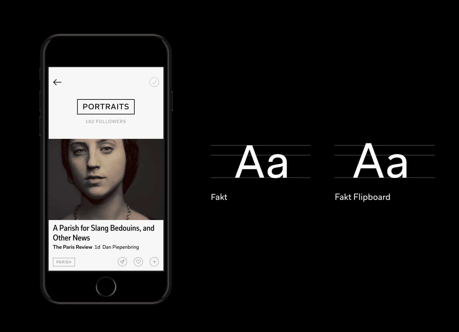
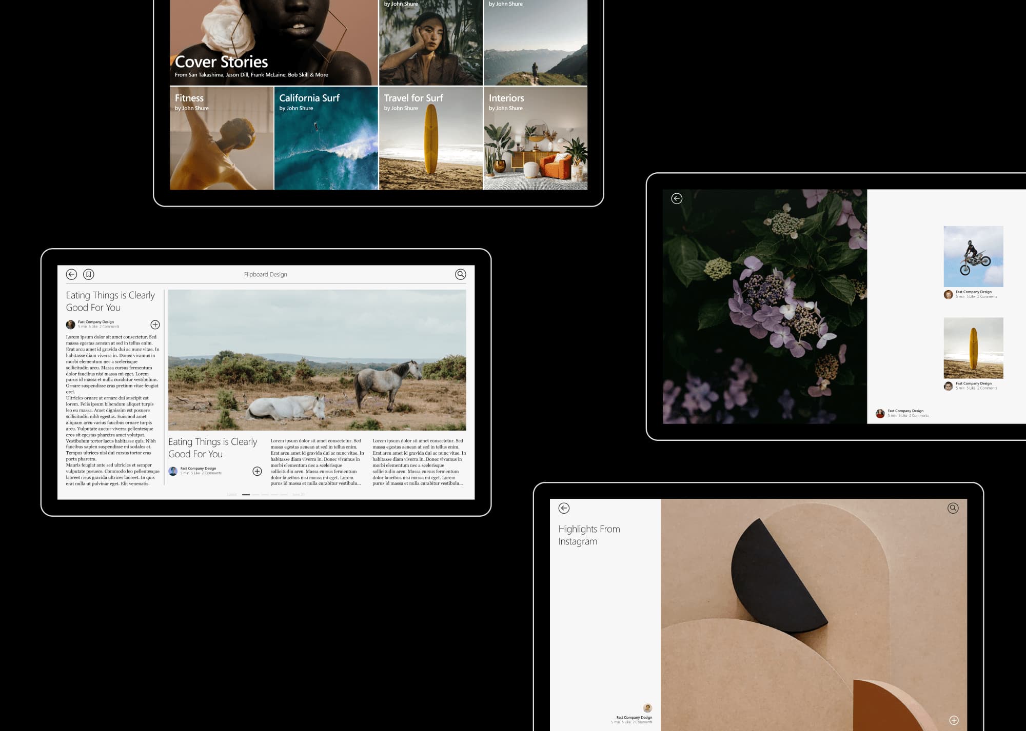
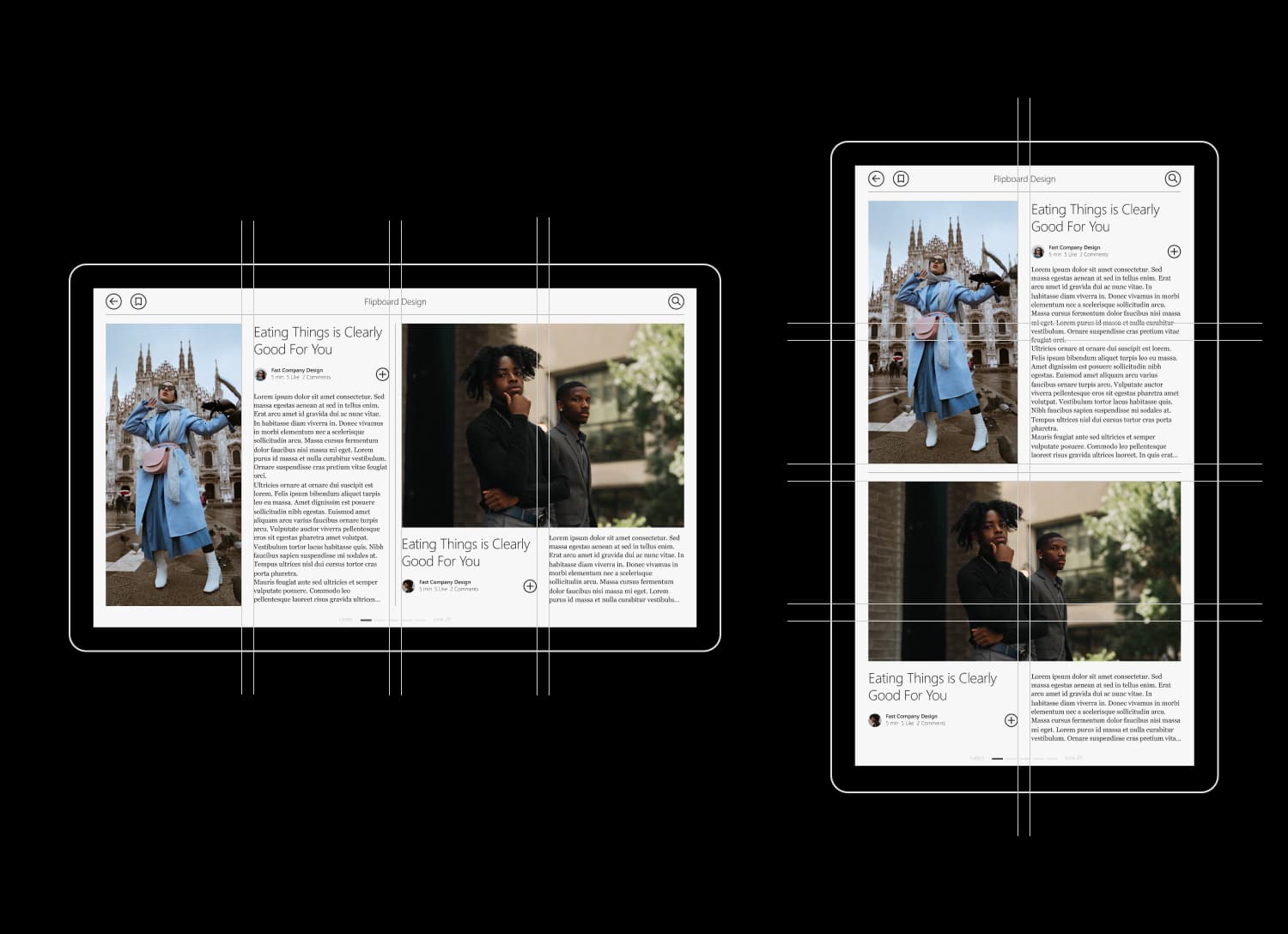
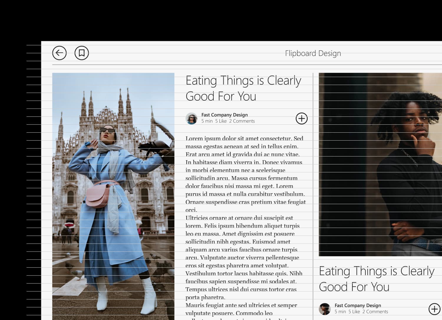
Flipboard for Windows required a re-think of the app in order to create an experience that fit naturally within the Windows ecosystem, but at the same time felt unmistakably like Flipboard. A new layout system was developed that relied on fewer building blocks but that was also more flexible and responsive to different screen sizes and orientations. The overall look and feel of the app was flattened and simplified in a move away from skeumorphism and a more precise typographic system established with a type scale that aligned to a common baseline grid across columns. The typography was changed from Helvetica on iOS to Segoe and all dialogs and interface elements were redesigned to feel more familiar to Windows users.
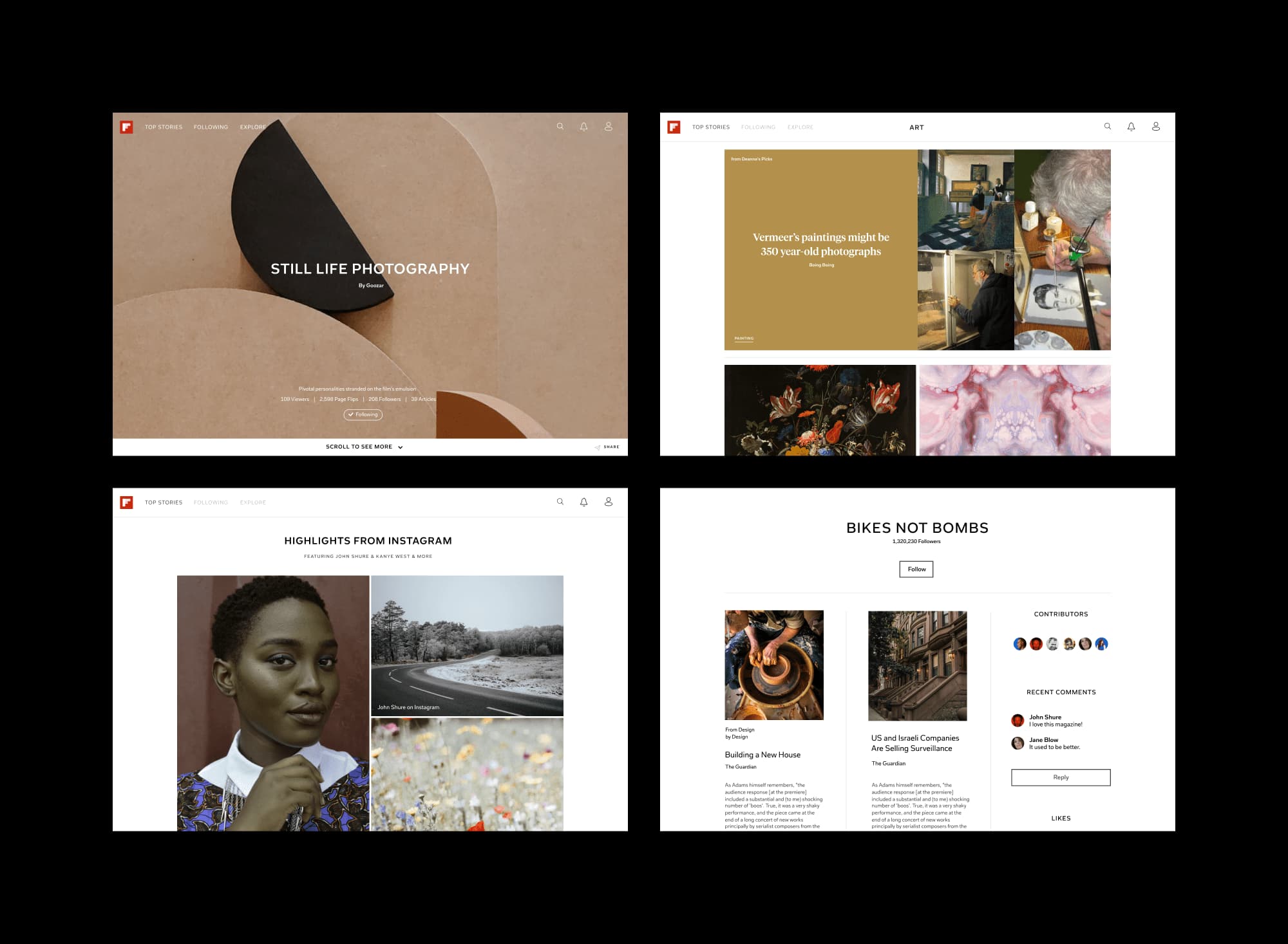
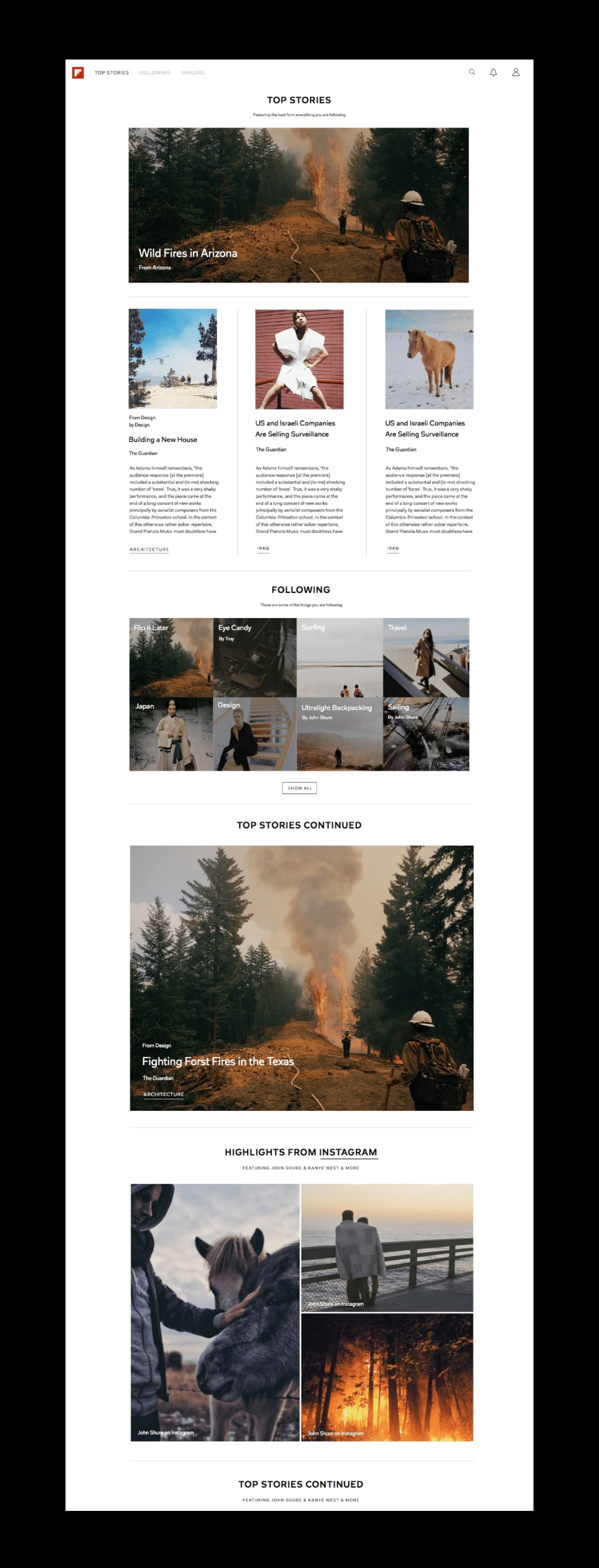
Flipboard for the web again required a different approach. Interaction patterns that felt natural on tablets and phones felt out of place on the web. Flipboard’s iconic ‘flip’ animation was dropped in favor of a vertically scrolling feed native to the web. To maintain a sense of pacing that the ‘flip’ helped establish on iPad and iPhone, a new dynamic layout system was created based on the web viewport height. This video shows what the web version looked like upon launch in 2015.