Figma
Lead product designer & co-lead for Figma brand direction
2016–2018
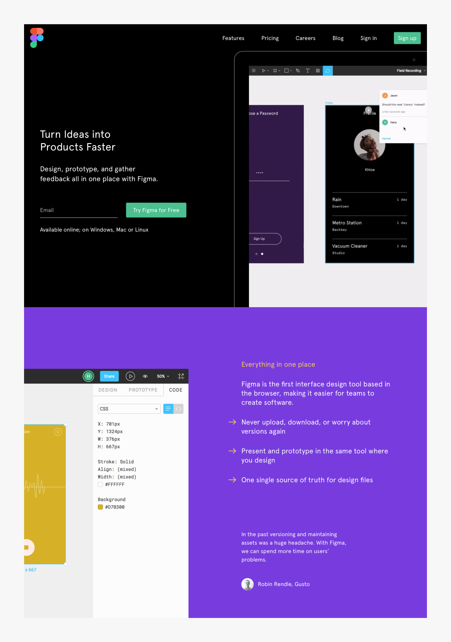
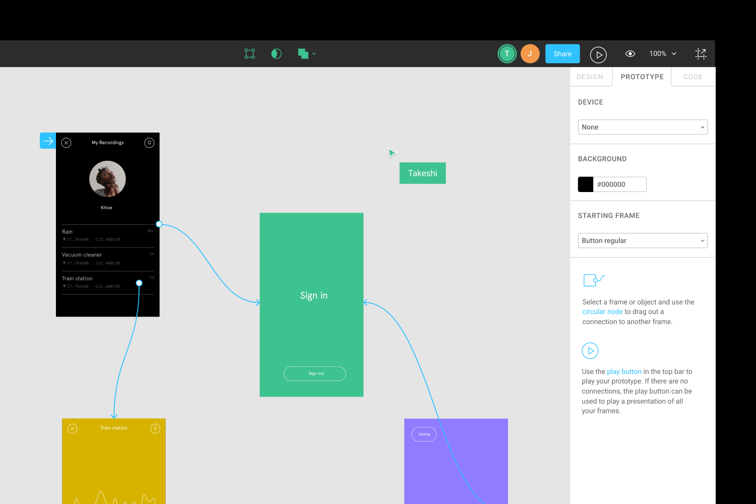
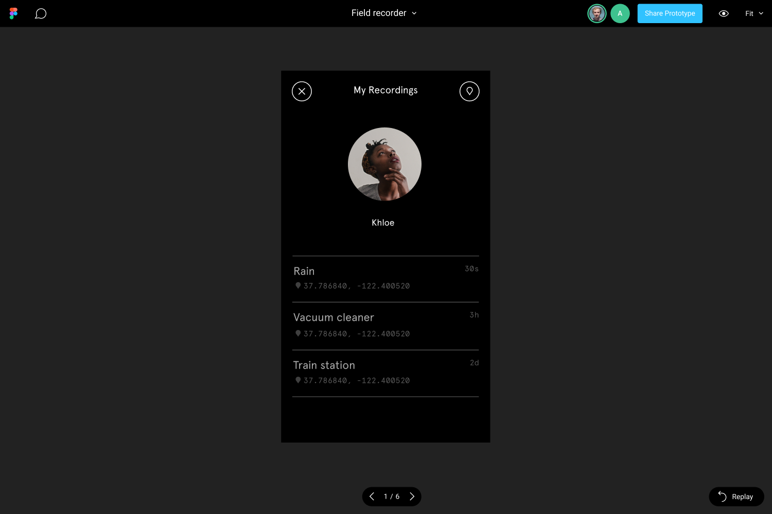
Figma is a cloud-based design and prototyping tool that allows designers to create and collaborate on a wide variety of design projects. Its real-time collaboration features enable multiple team members to work on the same design at the same time. The company was founded in 2014, with the first public version launched in 2016.
I joined Figma in 2016 where I lead the work creating the look and feel of the user interface as well as worked with the marketing team to define the brand ahead of a public beta and then the initial public launch. In 2016 Figma was a small team struggling to get designers on-board with the idea of working in a web tool. One reason for this was because of not trusting a new startup with their design files, and the look and feel of the earliest versions of Figma contributed to this sense of mistrust. Although Figma even at that early stage had most of the core functionality required of a professional design tool, it didn’t look the part. The primary goal of the work the design team did once I had joined the company, was to make the product feel more polished.
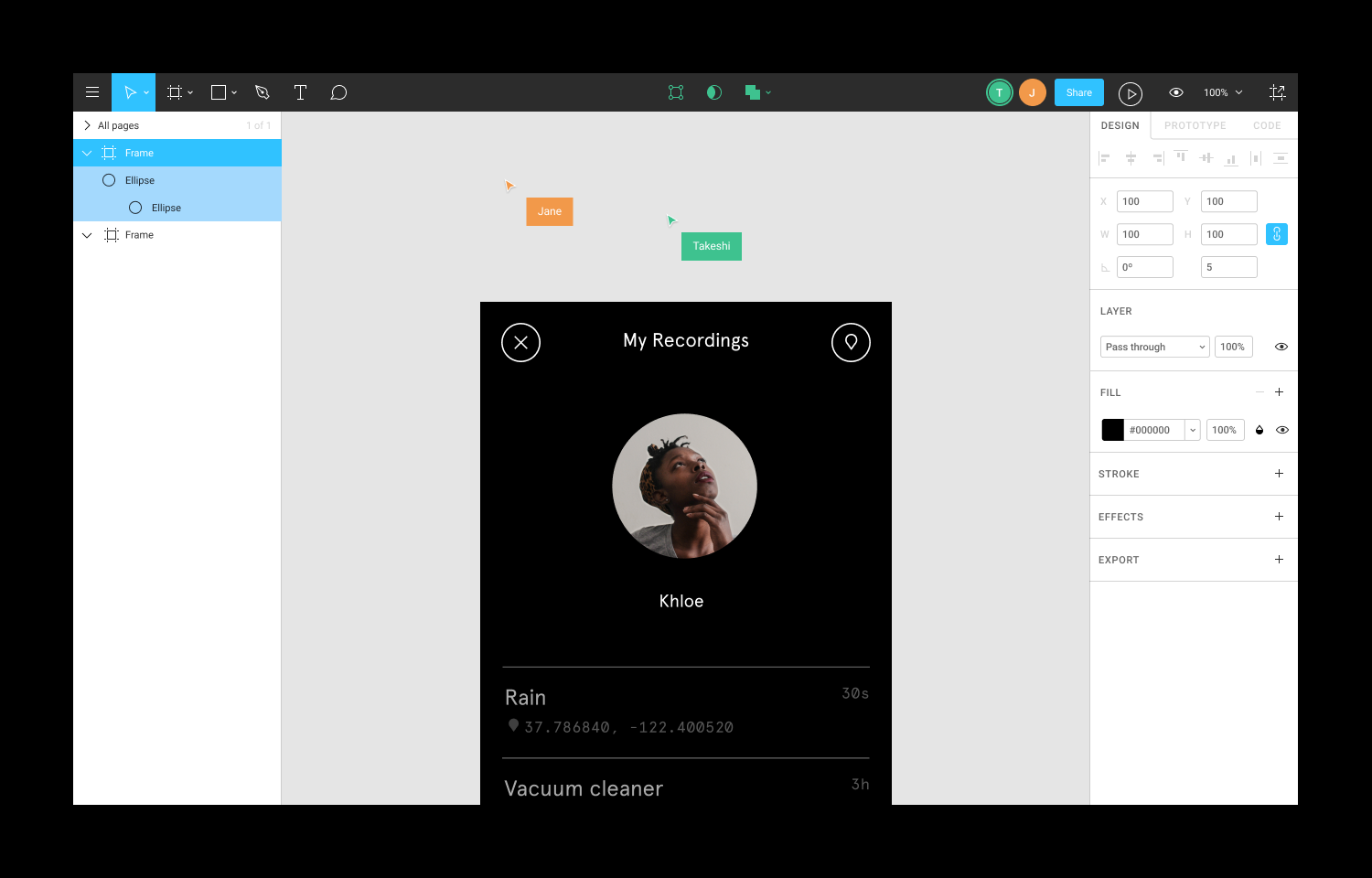
With Figma living primarily on the web, a product goal became to make it feel equally at home on Mac, Windows and Chromebooks. This principle came to define the flat look and feel of the tool. It was also one of the most controversial parts of the Figma design language, with many designers used to working on Macs and wanting a UI that looked native to their favorite platform.
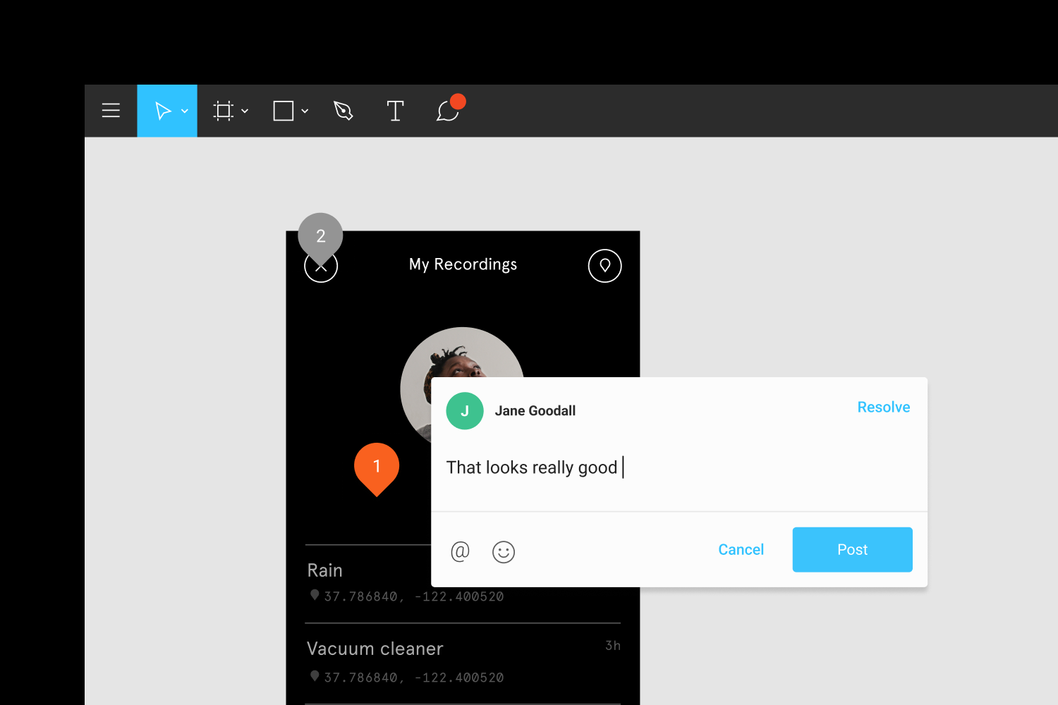
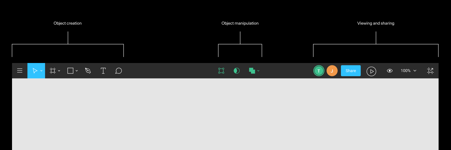
The design of Figma was also a reaction against equating design mastery with the mastery of a particular design tool. With certain competing tools, designers needed to acquire foundation of obscure knowledge specific to that tool before being effective in it, skills that really had nothing to do with design and did not translate to other tools. We wanted Figma to feel intuitive and unintimidating even for non-designers. This would make the barrier to switching from more established design tools lower, but also invite non-designers in as contributors and collaborators.
Figma was also an opportunity to define a different way of approaching product and brand design at a startup, one where designers on the product and marketing teams worked side by side to define the product, brand and culture of the company. It is common for startups to outsource this type of work to agencies, but there are numerous advantages to shaping an identity in-house. When working in-house, there is less of a need to land on a final set of design artifacts early on and it is instead possible to spend more time making sure the foundational design principles and culture created aligns with what you want to build over the long term. We saw Figma as being about celebrating the playful side of design and the joy of co-creation, tempered by a meticulous attention to detail. Design is fun, but it is serious fun.